CLIENT: Kai
ROLE: UX/UI Designer
DELIVERABLES: Website prototype, Branding, Site Architecture
TOOLS: Adobe XD, Illustrator, Photoshop, Invision
THE OBJECTIVES
Build a mobile app that utilizes the unique feature of kai’s business goals.
Develop coherent branding that aligns with kai’s brand personality.
Make donations quick and simple.
PROCESS: Market Research, Competitive Analysis, User Interviews, Empathy Maps & Personas
SECONDARY RESEARCH: Competitive Analysis, Market Research
EMPATHIZE
Process: Market Research, Competitive Analysis, User Interviews, Empathy Maps & Personas
I used a combination of market research, competitive analysis, user interviews, empathy maps, and personas to ensure the design was deeply aligned with the users' needs and experiences. These techniques helped me gain a better understanding of user pain points, motivations, and expectations, while also identifying opportunities and challenges in the market. By synthesizing these insights, I was able to create a design that was both informed by research and empathetic to the users, ensuring the final product would meet their needs effectively.
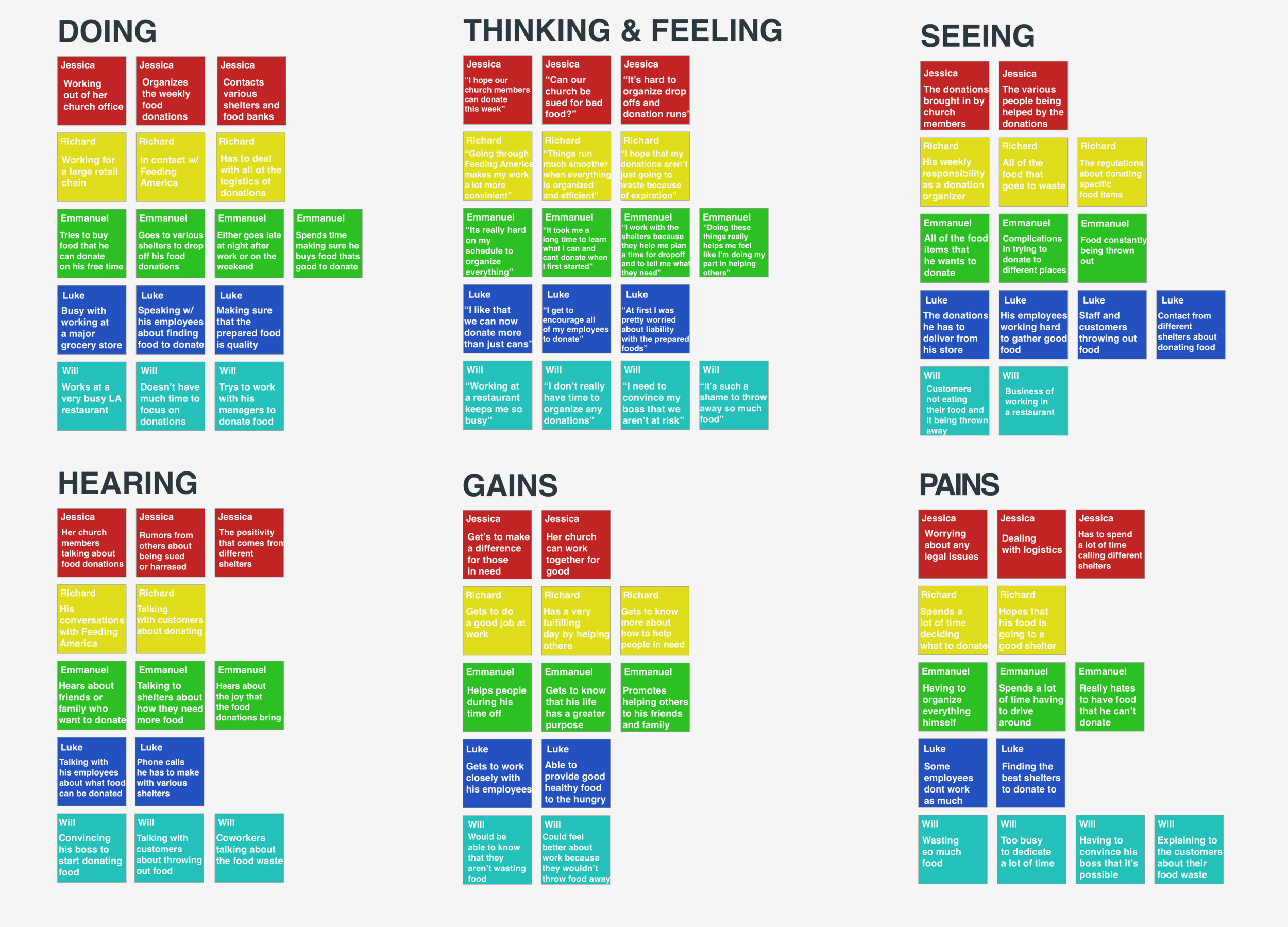
Empathy Map
I began the by creating an empathy map to better understand the core needs and pain points of our target users. This process helped me organize insights gathered from user interviews and market research, allowing me to visualize the thoughts, feelings, and behaviors of our users. By diving into the users' motivations and frustrations, I was able to identify key areas where the app could provide value and align with Kai’s business goals. The empathy map became a critical tool for shaping the design direction and ensuring that every decision, from the app's features to its branding, was user-focused and addressed real user concerns.
User Interviews
To gain a deeper understanding of the industry, I conducted interviews within the grocery sector, speaking directly with professionals who manage food donations. I spoke with 4 different managers across various grocery outlets to get a clearer picture of their attitudes toward food donations and their thoughts on a mobile app to facilitate the process.
Research Goals:
Define target customer demographics.
Understand customers' wants, needs, and goals.
Identify user frustrations and concerns.
Explore the purpose and potential impact of a mobile app for food donations.
Conducting the Interviews:
Number of Participants: 4
Ages: 32-58
Summary of Findings:
All interviewees expressed interest in finding convenient ways to donate leftover grocery stock.
The majority showed enthusiasm for a mobile app designed to simplify the donation process.
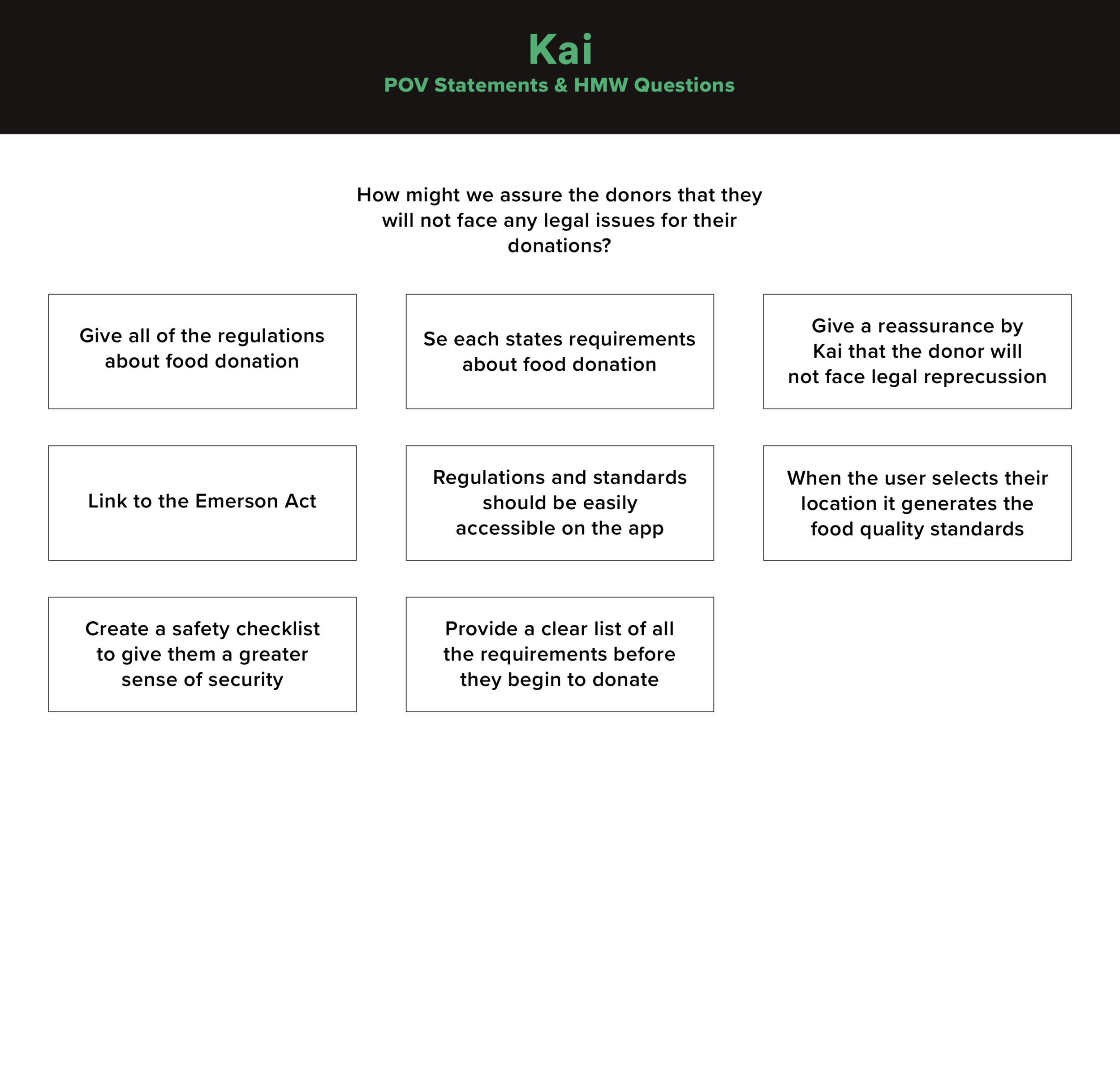
Several participants raised concerns about the legal implications of food donations, particularly the potential risks if someone were to fall ill after receiving donated goods.
User Personas
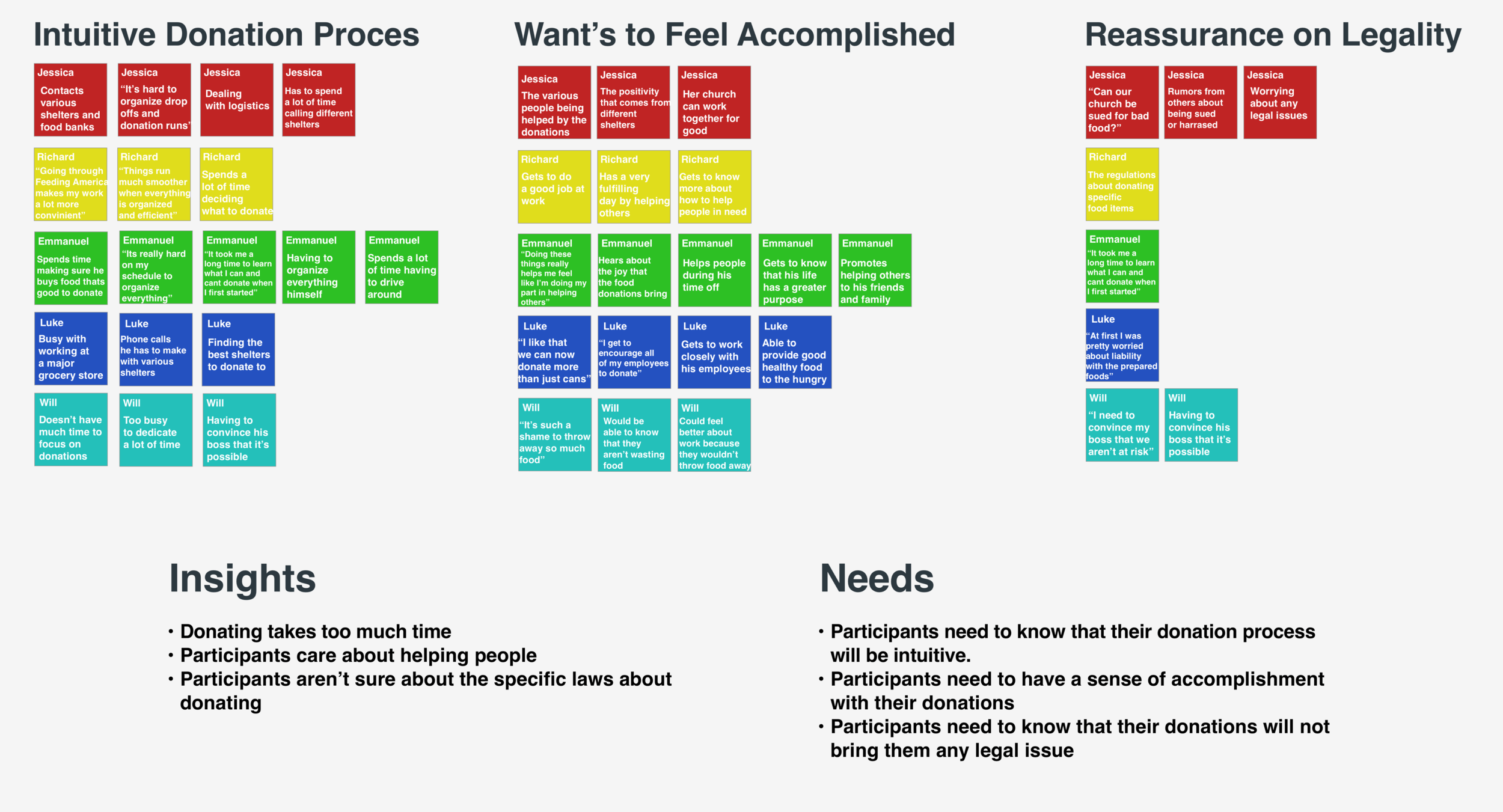
With my interviews done, I was able to create a user persona for the expected average user for kai. This helped me understand the user base on a general level so that I could better approach the next steps in implementation.
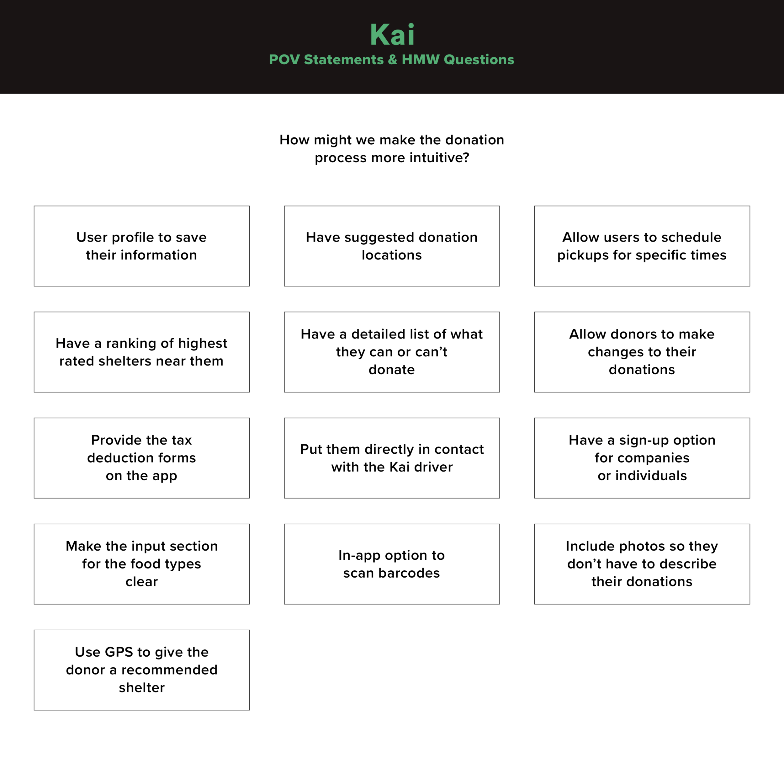
POV STATEMENTS & HMW QUESTIONS
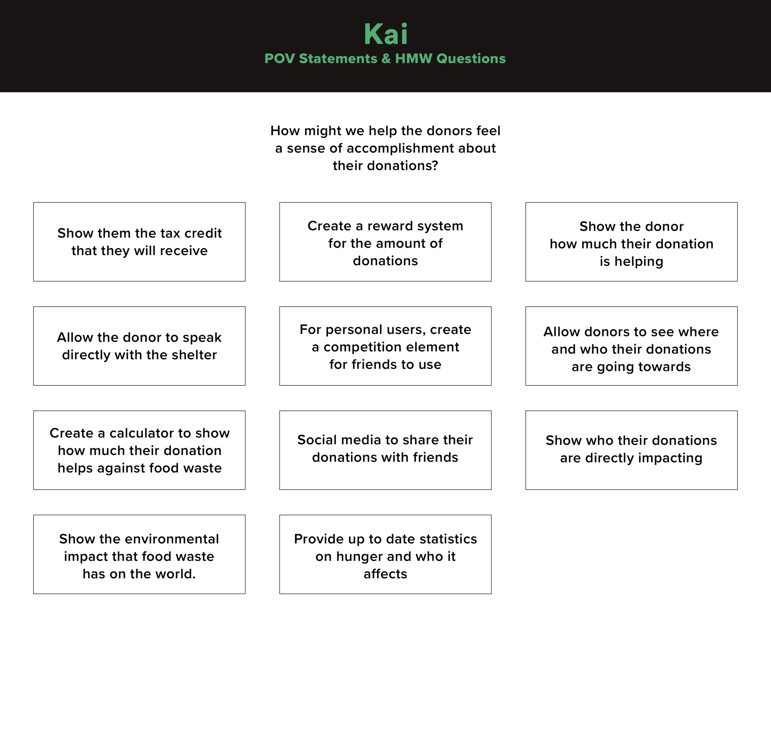
To start off, I took my research insights and took the point of view of the user.I needed to empathize with them. When I was able to get into their mindset I had to figure out how to address each concern. This was where my HMW (How Might We) questions came in. The HMW questions allowed me to quickly come up with ideas about how I could address the concerns of the client.
BRAINSTORMING
Once I was able to come up with these key questions, I had to figure out possible solutions to each problem. I didn’t want to fixate on one possible solution as it may not be the best solution for the user. I started to brainstorm possibilities by just listing out a series of several solutions for each HMW question.
PRODUCT ROADMAP
With the goals defined and properly thought-out I was able to start moving towards thinking of the layout and information architecture of the website. Before I jumped right into the design, I worked on a product roadmap so that I could assess the priority of the features that should be included.
ANALYSIS & DESIGN
PROCESS: Sitemap, User Flow, Task Flow, Low & Mid-Fidelity Wireframes
After defining the goals of the application, identifying the target user base, and exploring potential solutions, I proceeded to focus on the information architecture of the application. Drawing from my research insights, I began translating these findings into structured sitemaps and user flows. With a clear understanding of the necessary features and user needs, I organized the design to prioritize functionality, ensuring that the application’s architecture was intuitive and aligned with both user expectations and business objectives.
Site map
I created a site map to outline the overall structure and navigation of the application, ensuring a clear and logical flow for users. This map served as a blueprint for organizing content, defining user paths, and establishing the hierarchy of key features and pages. By mapping out the application’s architecture, I was able to identify the most efficient way to guide users through the app, enhancing usability and ensuring that every action was intuitive and aligned with the user’s goals.
LOW & MID FIDELITY WIREFRAMES
After I completed the general layout for Kai, I began to sketch out my rough ideas for how I would design the app. I started with sketches before moving onto the mid-fidelity wireframes using Adobe XD.
The mid-fidelity wireframes and sketches helped me figure out the rough layout for how the site should look. This layout allowed me to address the users needs while still solving Kai’s unique needs as well.
DESIGN
PROCESS: Brand Logo, Style Tile, High-Fidelity Wireframes
I conducted user testing with the mid-fidelity wireframes to gain valuable insights into the functionality and user experience of the design. The feedback from these sessions highlighted areas for improvement, prompting me to iterate on the initial design. I revisited my initial sketches and made targeted adjustments to better address the user concerns and needs identified during the testing process. This iterative approach allowed me to refine the design, ensuring it was more aligned with user expectations and enhancing its overall usability.
HIGH-FIDELITY WIREFRAMES
With the sketches and design elements finalized, I moved forward with developing the high-fidelity wireframes for the application. Below is a prototype representing the first stage of the design process. While the product is still under development and several pages remain to be designed, this prototype has provided valuable insights into the overall structure and user flow of the app, enabling me to refine the design and ensure it aligns with the intended user experience.
Conclusion
The Kai project presented an engaging and rewarding challenge. While it remains a work in progress, I found each phase of the design process both stimulating and insightful. One of the key challenges was the redesign required after conducting user testing with the mid-fidelity wireframes. This phase prompted me to critically assess the elements that worked well and identify areas for improvement. It required adaptability and quick decision-making to implement the necessary revisions while maintaining progress on the rest of the design process.
Next Steps
Creation of Additional Screens
The application is still under development, and several more screens need to be designed. Completing these screens will allow me to further develop the app, creating a more comprehensive and functional prototype that better represents the finished product.
Development
Once the design is fully fleshed out, the next step will be to transition into the development phase. This will involve coding the designs into a fully functioning, live application, bringing the user experience to life and ensuring seamless integration of all design elements.
