CLIENT: International Student Mentorship Program
ROLE: UI/UX Designer
DELIVERABLES: Full website design with mobile responsive design
TOOLS: Figma, Illustrator, Photoshop, Marvel
THE OBJECTIVES
Build a website that communicates the goals and interested of International Student Mentorship.
Develop a brand guide to function across all marketing materials.
Create a simple application process.
The Brief
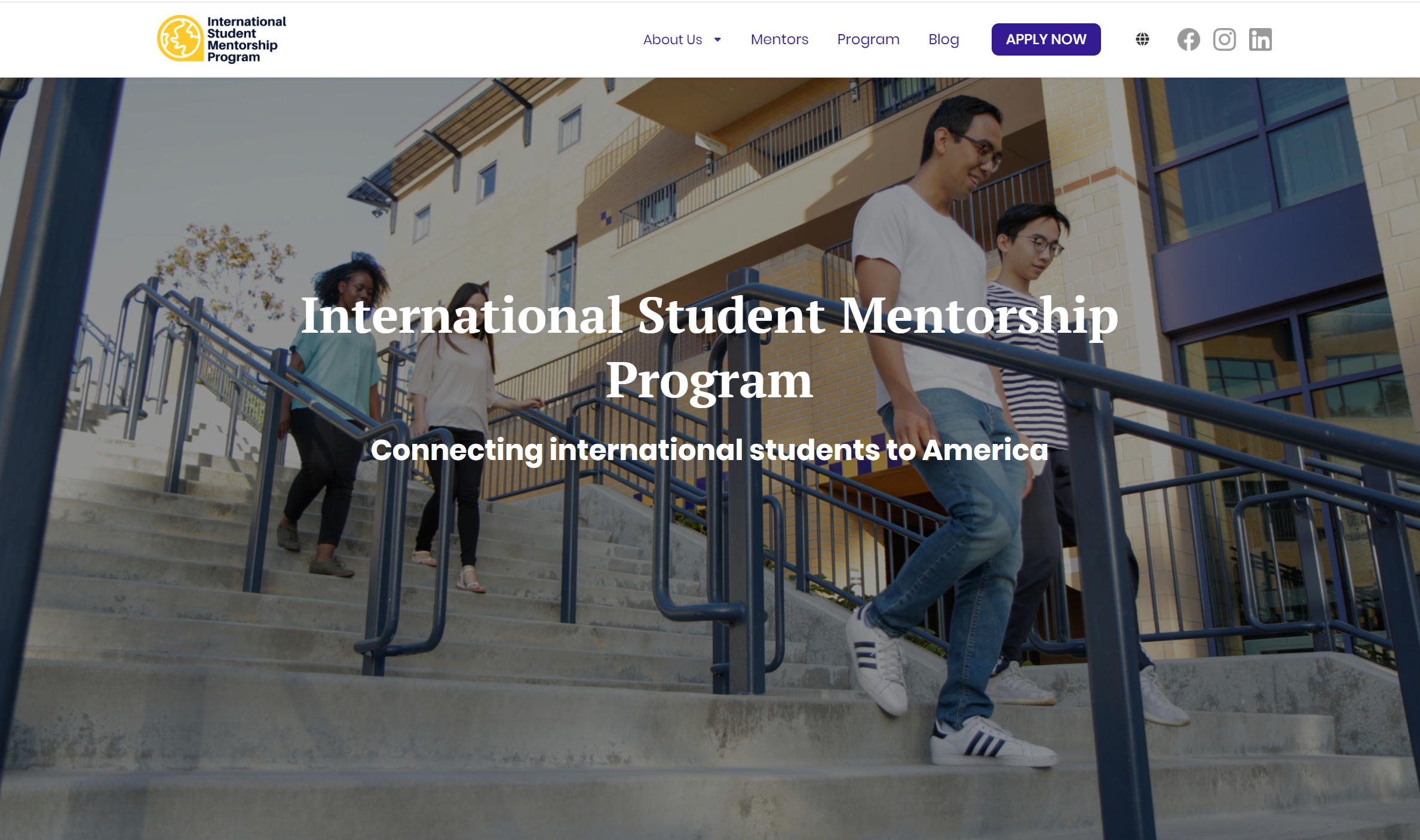
International Student Mentorship Program needed to create a website to launch side-by-side with their global marketing plans. The idea was to design and develop a new website from scratch that the company could send to universities and private institutions around the world. This presented several challenges from having to look at the project from a global perspective to understanding the best approach to make the site as approachable and easy to use for any market.
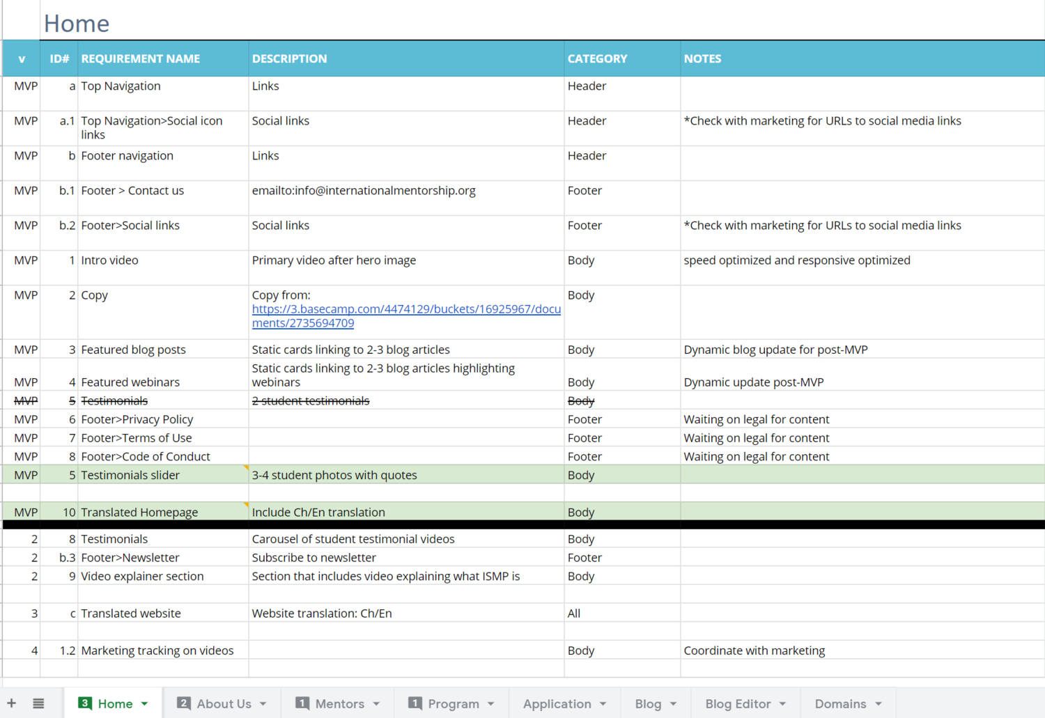
Design Requirements
To start off the project, my team of three designers along with the developers and project manager worked together to define the goals and requirements of the site. This allowed us to prioritize our design process and to discover the highest needs for the site.
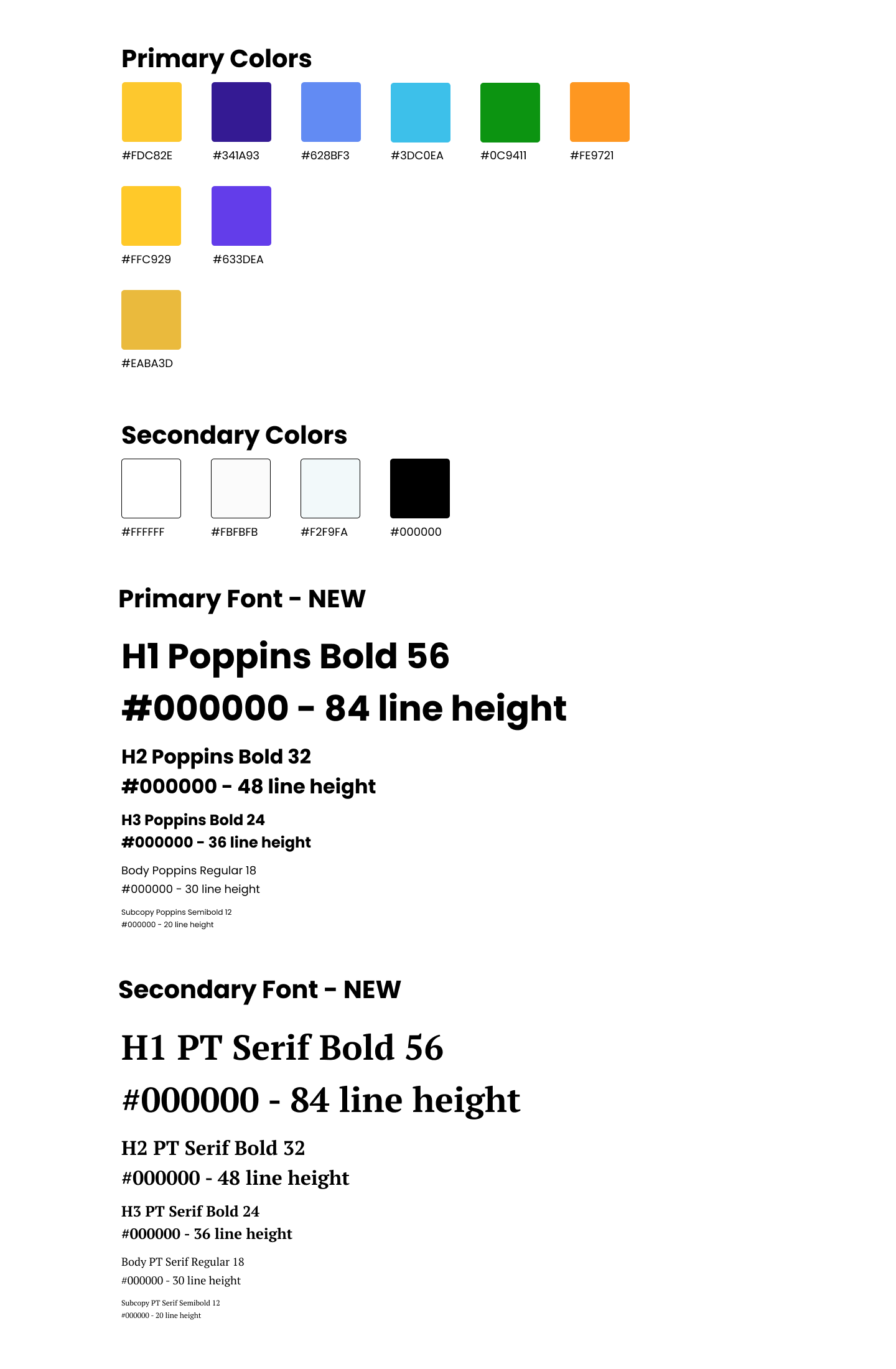
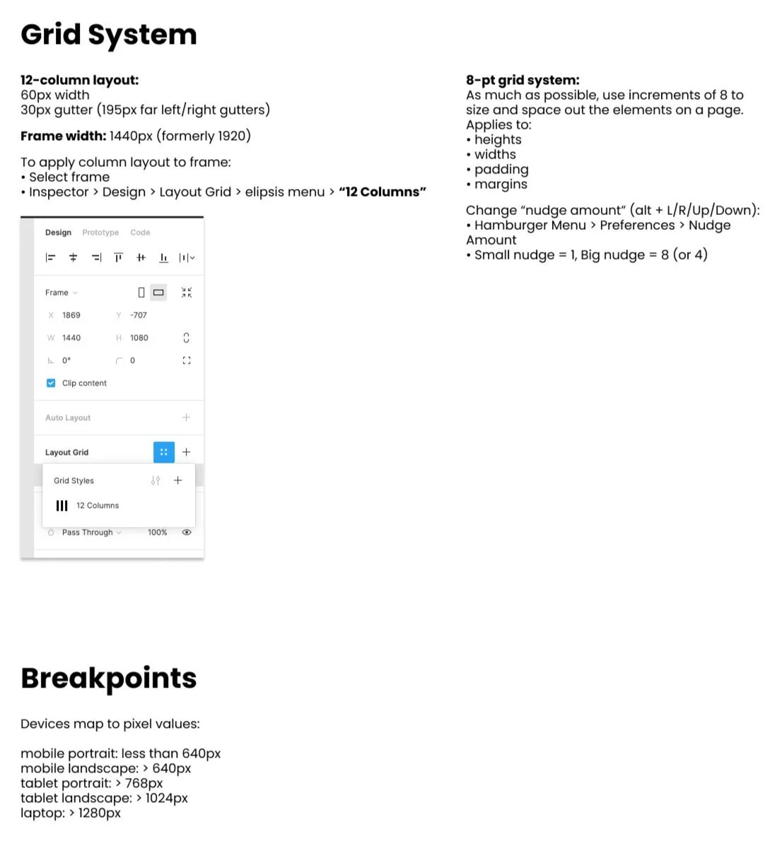
Brand/Style Guide
With the requirements layed out and defined, my team started working on the development of the site brand guide and the style guide. This helped us in the early stages of designing the site because it gave us a clear goal of how our site would look in terms of an overall layout and structure.
Mid-fidelity Wireframes
I was responsible for crafting detailed mid-fidelity wireframes using Figma, focusing on establishing a clear structure and intuitive user journey. These wireframes captured essential design elements such as layout, spacing, user interaction points, and content prioritization—without introducing final visual styles—ensuring that the team could concentrate on functionality and usability.
I worked cross-functionally with UX researchers, product managers, and developers to translate user research insights into actionable design decisions. We held iterative feedback sessions with stakeholders and end users, allowing us to refine navigation patterns, user flows, and key decision points before moving into high-fidelity mockups.
In addition to designing responsive layouts for both desktop and mobile experiences, I documented interaction logic and annotations within Figma to streamline the handoff to developers. This process not only enhanced team alignment but also reduced development revisions and accelerated the build phase.
The wireframes became a cornerstone for the visual design phase, usability testing, and developer sprints—ensuring a user-centered and scalable end product.
Brainstorming
After completing our initial mid-fidelity wireframes, our team paused to evaluate design challenges and evolving project requirements. Collaborating closely with the development team, we identified technical constraints and user experience gaps, then updated our requirements accordingly. These insights led to a refined design direction with improved layout structures, streamlined interactions, and better alignment with both user needs and technical feasibility—ultimately strengthening the final product.
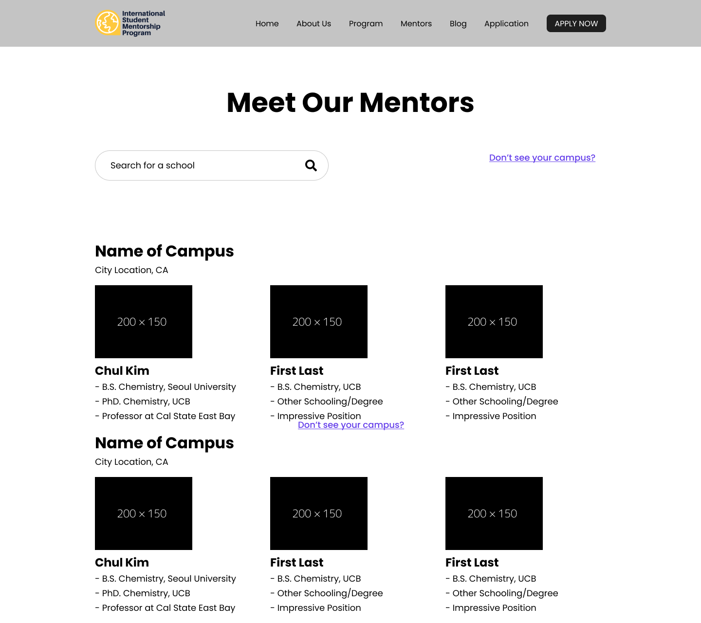
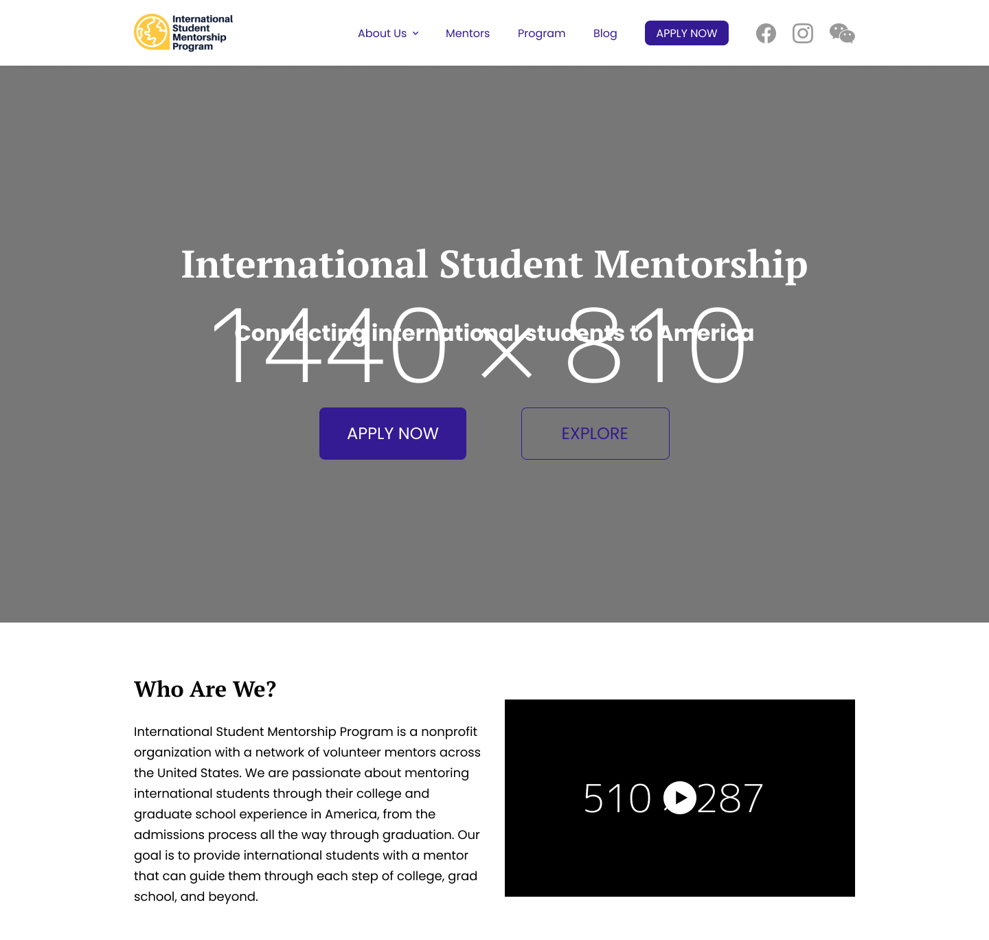
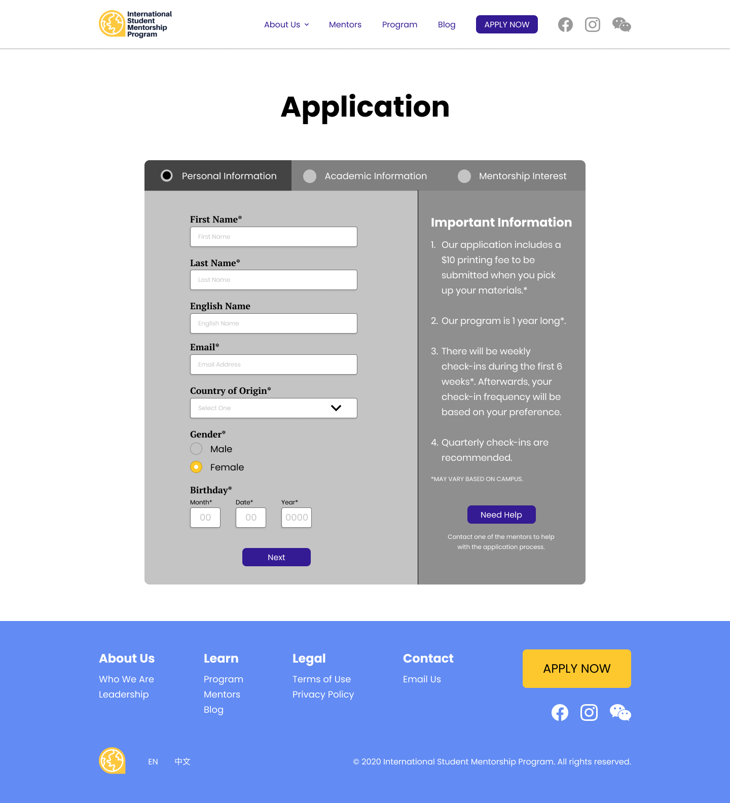
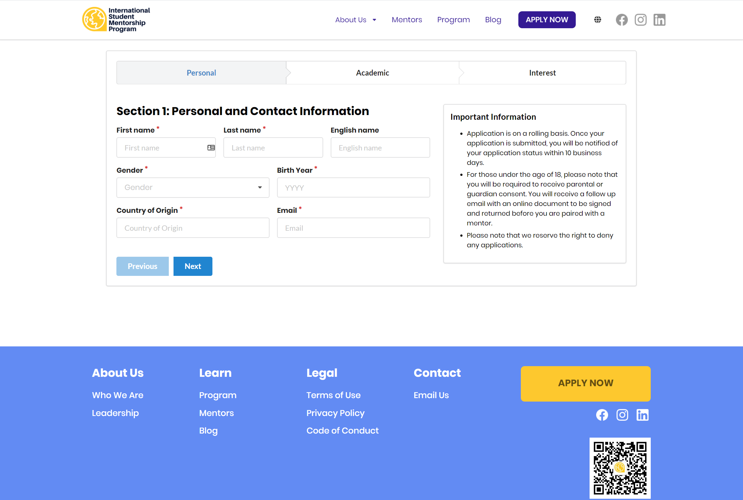
High-Fidelity Wireframes
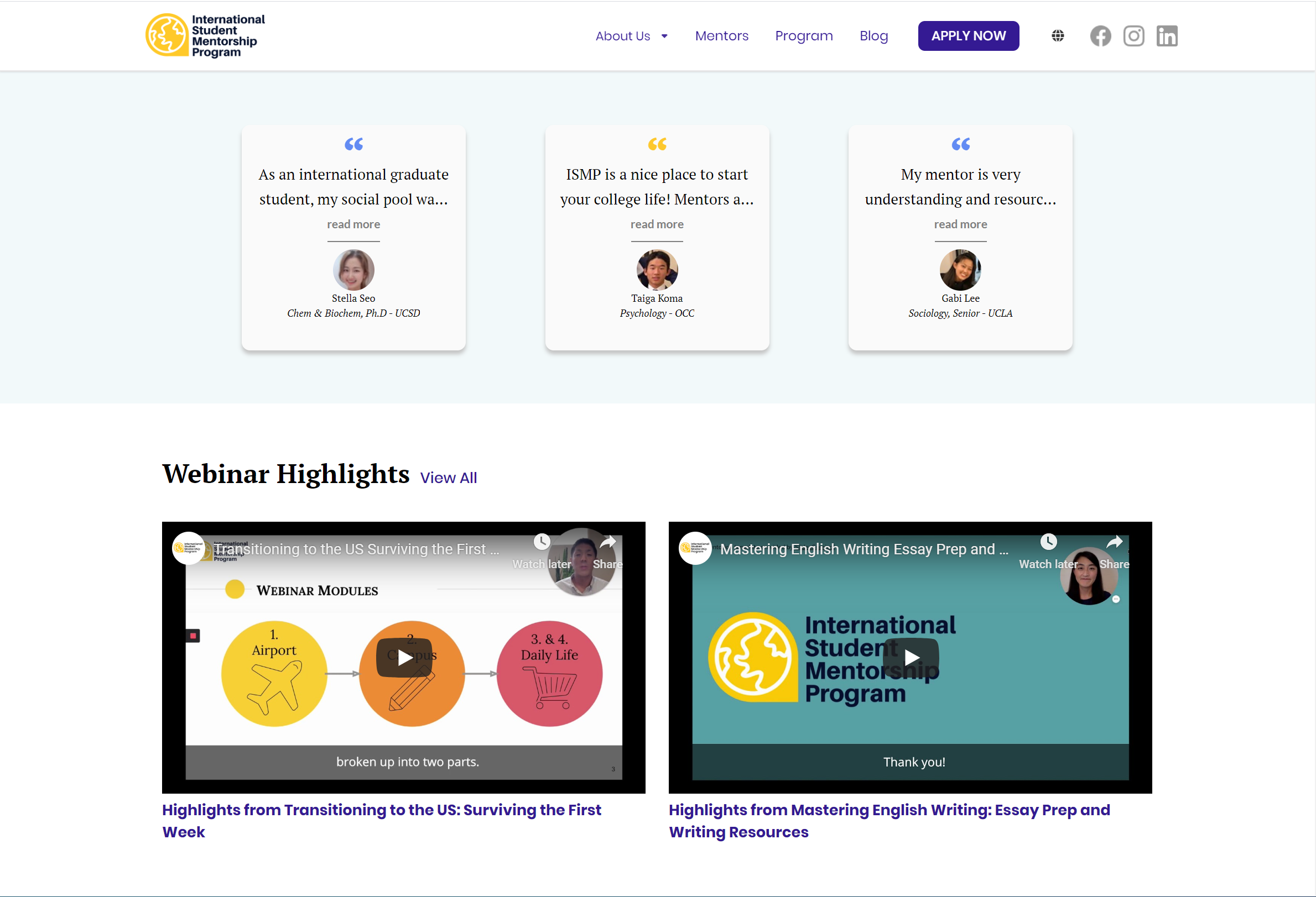
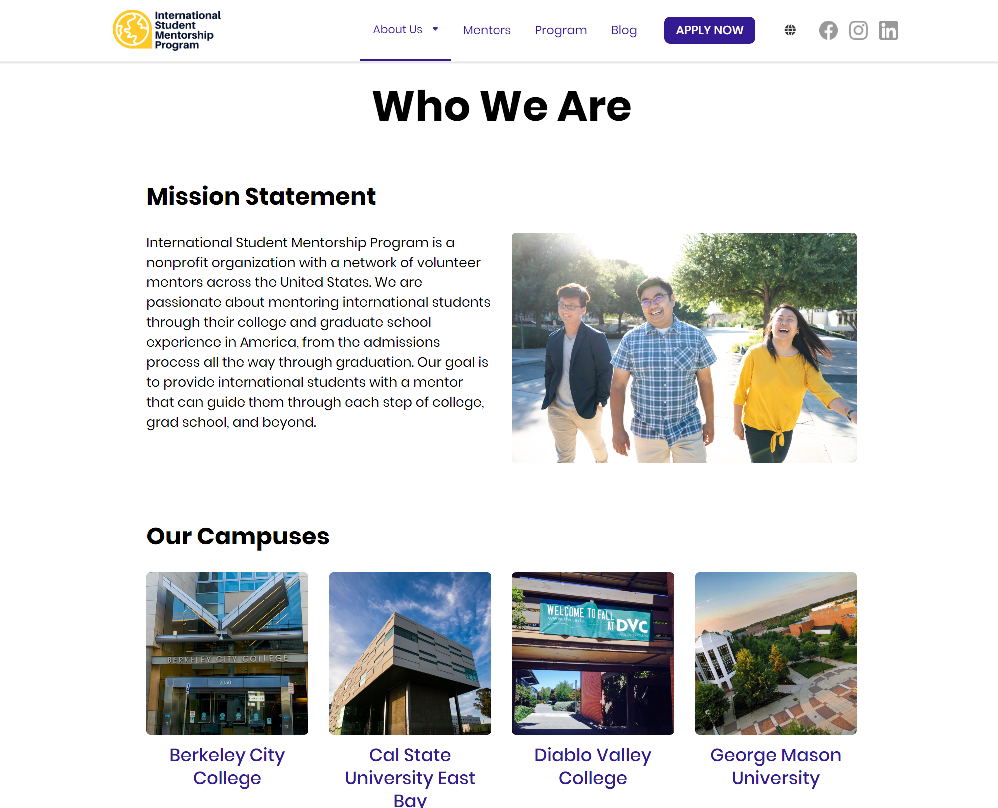
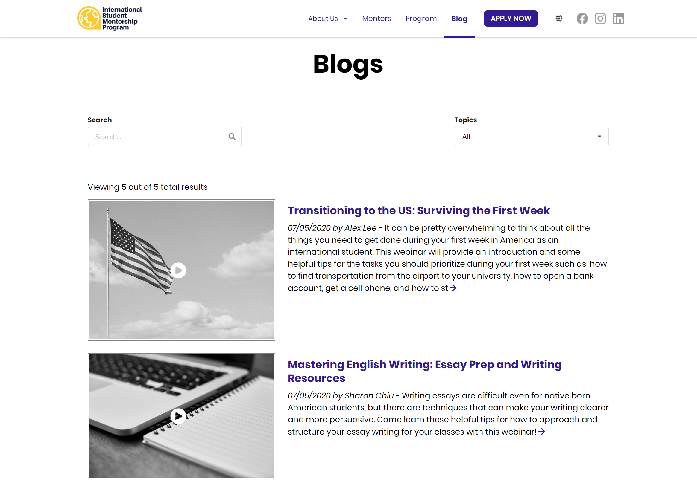
With our mid-fidelity wireframes finalized and requirements clearly defined, we moved into crafting high-fidelity wireframes in Figma. This phase brought the design to life with polished visuals, brand elements, and interaction states. We focused on accessibility, visual hierarchy, and responsive layouts, while collaborating with developers to ensure a smooth handoff and pixel-perfect implementation. The result was a user-centered, production-ready design aligned with both business goals and technical constraints.
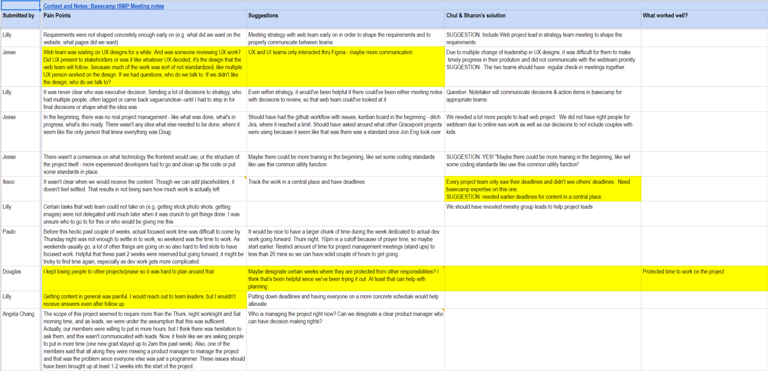
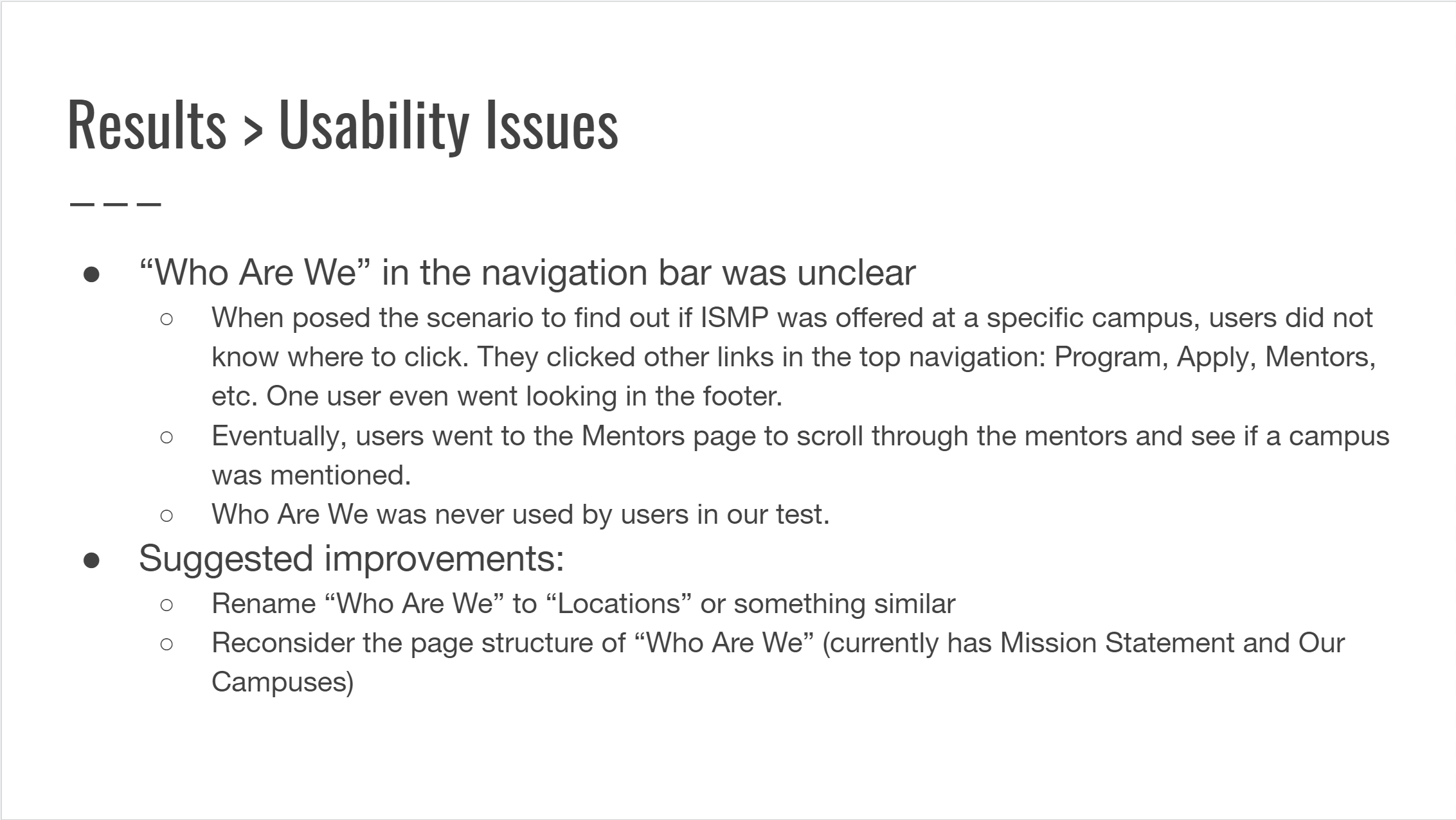
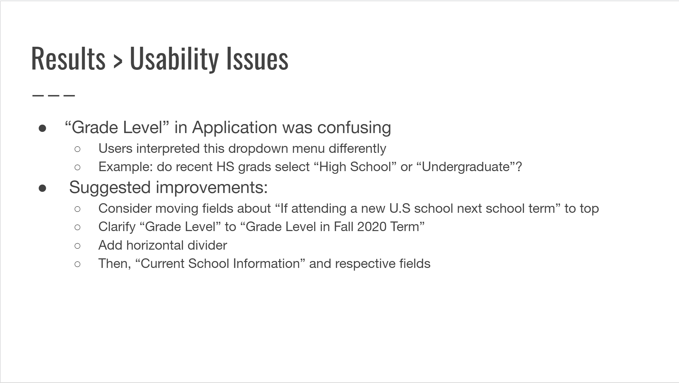
User Testing
Following the completion of the website, we transitioned into the user testing phase to evaluate overall functionality and user experience. These sessions provided valuable insights into how first-time users interacted with the site, helping us assess its intuitiveness, usability, and navigational flow. By observing user behavior and asking targeted questions, we identified pain points that may have been overlooked during the design process, ensuring a more accessible and user-friendly final product.
CONCLUSION
After reviewing the results of our user testing, we implemented a focused round of design revisions to address key user concerns and improve overall usability. While no major issues were identified, the feedback helped us fine-tune specific elements—such as button placements, labeling clarity, and micro-interactions—to better support user expectations. Thanks to our collaborative workflow and well-documented design system, the revision process was efficient and seamless. The final product was a thoughtfully refined, user-centered experience that met both functional requirements and design goals.